Made of Clay
University Branding Project

Role: Brand Designer
Period: University Project
Tools: Adobe Illustrator, Adobe Photoshop (first contact with Adobe)
Industry: Handmade jewellery / artisan retail
Project overview
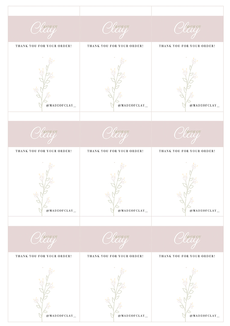
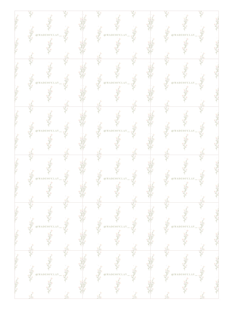
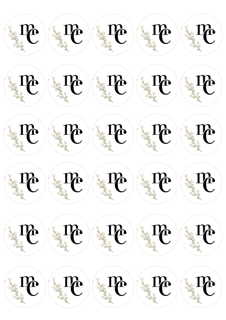
Made of Clay was a branding project I created during university as my first ever experience using Adobe. The goal was to develop a complete brand identity for a clay earring business, focusing on a warm, handmade look and consistent visual elements. This project allowed me to explore brand personality, packaging concepts and platform ready graphics while building my design foundations.
Global Strategy
Objectives
Target Audience
Young adults interested in handmade jewellery, craft markets and small business brands with a soft, warm, artisan aesthetic.
Strategy & Approach
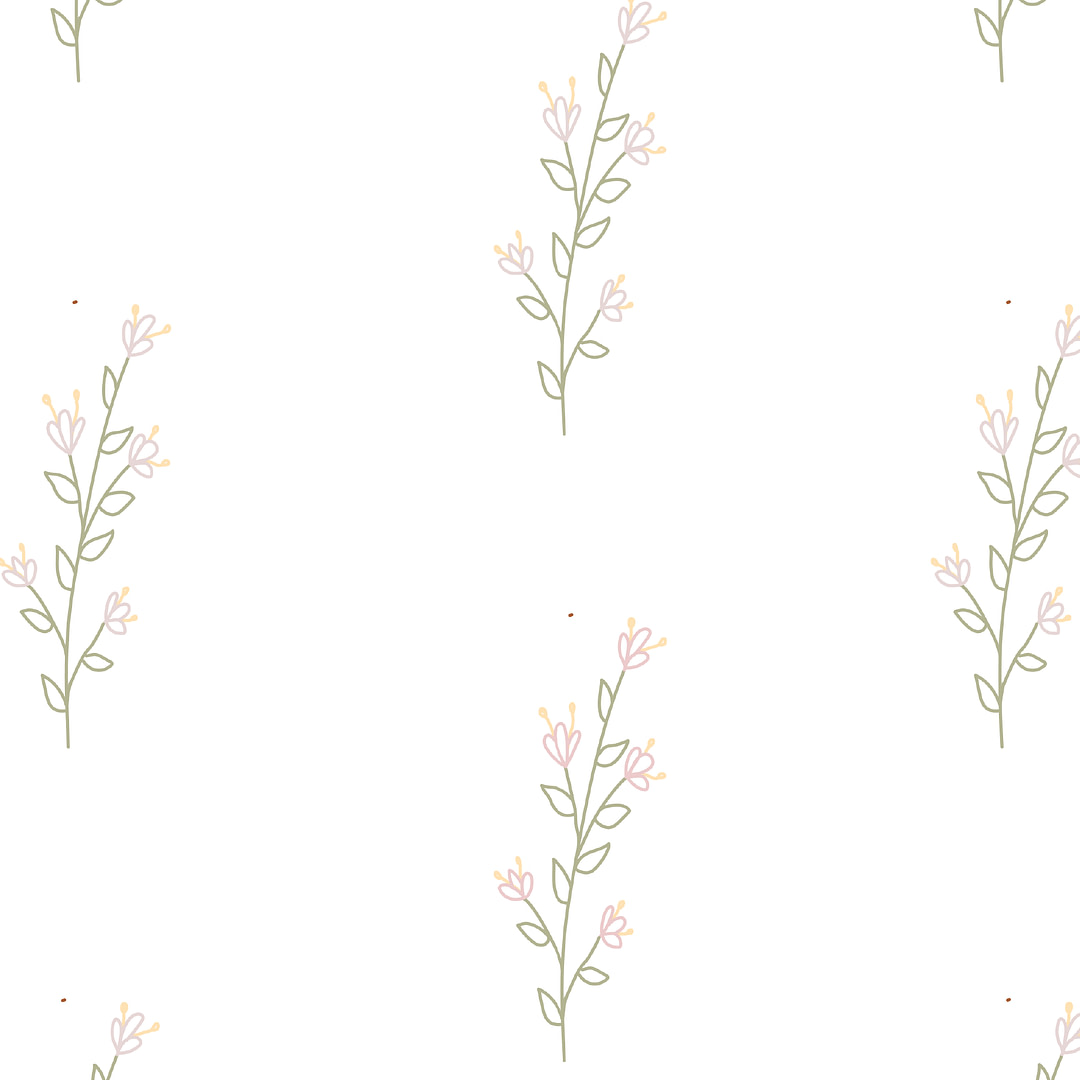
Chose a soft, earthy colour palette to reflect clay materials
Developed a handwritten style logo for a personal, handcrafted feel
Created packaging and cards designed for small business presentation
Built graphics that could be used on Instagram and Etsy style platforms
Focused on clean, simple visuals that highlighted the product’s handmade nature
Creative Work